
Observability Platform
Designing cohesive observability experience to monitor resources
DigitalOcean provides AI-native cloud platform accessed through control panel (called console). It provided basic monitoring for very limited parameters. However, DigitalOcean needed to replace a fragmented, siloed monitoring experience with a single unified observability platform across multiple distinct product areas. The challenge wasn't just design complexity — it was people complexity. As the sole designer, I had to align multiple PMs across platform, each with different priorities and definitions of success and shape a cohesive experience from their competing requirements.
MY ROLE
Lead Designer — sole designer across all product areas
TEAM
Multiple PMs (one per product area), Engineering, AI/ML
PLATFORM
DigitalOcean Control Panel — cloud infrastructure mngt
SCOPE
AI Inference · Kubernetes · GPU Droplets · Monitoring
CONTEXT
A PLATFORM THAT COULDN’T SEE ITSELF
DigitalOcean's existing monitoring experience was built product by product, team by team. Each product area had its own interpretation of what observability meant: some offered basic metrics at the resource level, others had nothing at all. Users — developers, DevOps leads, CTOs managing large infrastructure — had to navigate multiple disconnected surfaces to understand what was happening across their systems.
The business goal was clear: replace the legacy "Insights" tab with a high-fidelity, integrated observability platform — a single pane of glass for metrics, logs and alerts across all DigitalOcean products. The goal was to help users reduce time to recovery, optimize cost of ownership and drive adoption toward paid high-fidelity GPU telemetry.
DigitalOcean's Disconnected monitoring meant slow troubleshooting, blind spots and runaway costs. Developers were piecing together their system's health from four different places — none of which spoke to each other.
- Synthesis from user research and stakeholder discovery
USERS
The platform needed to serve three distinct user types with very different needs:
Lead devs & DevOps leads managing infrastructure at scale;
CTOs tracking cost and resource efficiency
Kubernetes/GPU power users running large DOKS clusters, GPU Droplets with advanced telemetry requirements.
UNDERSTANDING USER NEEDS
Due to fast paced nature of the work and tight timeline to launch by DigitalOcean conference, there was not time for external user research. So I conducted research with internal users:
No. of users : 12
Format: 1:1 interviews
Selection criteria: Currently using metrics, logs etc.
THE REAL CHALLENGE - FRAGMENTATION
MULTIPLE PRODUCT AREA, MULTIPLE PMs, ZERO SHARED DEFINITION
The technical problem — designing an observability platform where same tech will render observability insights for each product — was complex but tractable. The organizational problem was harder. Each product area had its own PM, its own roadmap and its own understanding of what observability should look like for their users.
PRODUCT AREA 01
AI Agents & Inference
PM needed cost transparency, token usage, latency distribution, and model performance data. Business metrics alongside technical health signals.
PRODUCT AREA 02
GPU Droplets
PM needed GPU-specific advanced metrics — SM efficiency, clock frequency, fault counts, thermal alerts — alongside standard compute health.
PRODUCT AREA 03
Kubernetes
PM needed cluster-level health, node metrics, control plane visibility, and GPU metrics for AI workloads. Complex, technical, multi-level hierarchy.
PRODUCT AREA 01
Monitoring Dashboard
PM needed a fleet-wide GPU management view across all resource types — a control room, not a detail page. Different scope entirely.
THE REAL CHALLENGE - COLLABORATION
NO REQUIREMENTS DOC. JUST PEOPLE WHO KNEW THEIR DOMAIN
There were no formal requirements handed to me. Each PM understood their product area deeply — they knew what metrics mattered, what engineers were building, what users were asking for in support tickets — but that knowledge lived in their heads, not in documents. My first job was to extract it, structure it, and turn it into something I could design from.
I ran a dedicated discovery session with each PM and their engineering lead. I'd go in with a set of questions aboutcurrent knowledge, user needs, technical constraints etc.
HOW I STRUCTURED COLLABORATION WITH EACH TEAM
Discovery with PM: Understand the metrics to be surfaced, the user problems we were solving & the business goals behind the feature
Technical deep-dive with engineers: Understand what data was available, what was technically feasible to surface in real time & backend work vs frontend-only changes
Design exploration: Present multiple visual directions for how to show the same data — so PMs and engineers could react to something concrete, not hypothetical
Iterative review cycles: Share work-in-progress designs with each team separately, then bring cross-team decisions back to the group to check for consistency
Finalization: Sign-off from both PM and engineering lead before moving to the next area — preventing late-stage surprises or scope creep
Building direct working relationships with engineers — not routing everything through PMs — made the designs more technically grounded and saved significant rework later.
CORE DESIGN CHALLENGE
BUILD ONE COHERENT OBSERVABILITY EXPERIENCE FOR DIVERSE PRODUCTS
How do you build one coherent observability experience when each product area legitimately requires different information, different hierarchy, and different interaction patterns? A single template wouldn't work. But four completely divergent experiences would destroy the product's value proposition.
INSIGHT - The alignment problem I had to solve before any design could start
Without a shared framework, each PM would pull the design toward their area's needs. I needed to establish a common design language and structural pattern that every product area could adopt while still meeting their specific requirements.
I proposed a layered observability model: a consistent shell (health overview → metrics → logs) that each product area could populate differently, with a shared visual system, shared component library and shared interaction patterns. The content within would be tailored per area. This was the negotiation I ran with every PM before I opened a design tool.
DESIGN STRATEGY
ONE SYSTEM, MULTIPLE EXPRESSIONS
#1 - Hierarchical Observability Experience
The architectural principle I established was a three-level observability hierarchy consistent across all product areas: platform-level overview, fleet/resource-level detail and individual resource deep-dive. Users moving between different products would always know where they were in that hierarchy.
#2 - Basic and Advanced Metrics
I introduced the concept of Advanced Metrics — a tiered model that kept the free-tier experience clean and focused, while unlocking richer telemetry (GPU-specific metrics, control plane data, inference latency percentiles) for paid tiers. This wasn't just a business decision — it was a UX decision that let me keep default views uncluttered without hiding critical data from power users who needed it.
DESIGN PRINCIPLES I SET FOR THE EXPERIENCE
Simplicity first: Abstract complexity — surface the insight, not the raw signal. Users should understand system state at a glance, not after reading six charts
Contextual: Every metric should be meaningful where it appears. GPU clock frequency belongs on the GPU Droplet page — not as a generic "advanced metric" buried in a settings panel
Intuitive: Users shouldn't need documentation to understand what's healthy, what's degraded, and what to do next
Scalable: The system needed to accommodate product areas that didn't exist yet. Every pattern had to work for future DigitalOcean products, not just today's four
DESIGN EXPLORATIONS
FROM LIST OF METRICS TO VISUAL LANGUAGE
Once each PM had walked me through their required metrics, the design challenge shifted: how do you show this data in a way that's immediately useful, not just technically accurate?
What makes a metric meaningful is how it's presented — the chart type, the time range, the hierarchy it sits within, the context it's given.
Exploration #1
Exploration #2
Exploration #3
DESIGN - PRODUCT AREA 01
AI Inference — Cost, Performance & Model Intelligence
For AI Inference product area, users weren't just monitoring infrastructure — they were monitoring model behavior and cost. Token usage, latency distribution, cost per model, savings versus competitors — these were business metrics as much as technical ones.
DECISION - Analyze & Manage as a unified cost + performance surface
The PM initially wanted separate pages for cost and performance. I pushed back — users making cost decisions need performance context and vice versa. I designed the Analyze & Manage view to answer "what am I spending, on what and is it performing?" on a single surface — with a savings comparison against direct provider pricing as the hook that made the value case for DigitalOcean immediately visible.
Analyze & Manage — unified cost and performance view with competitor savings comparison
Optimize Insights — evaluation health, revenue breakdown and token consumption trends
Dedicated Inference Insights — SLA compliance, GPU utilization, endpoint request metrics & latency percentiles
Serverless Inference Insights — cost, token usage and errosr
DESIGN - PRODUCT AREA 02
GPU DROPLETS : TRANSLATING SIGNALS INTO ACTIONABLE INSIGHTS
GPU Droplets required the deepest domain knowledge of any product area. GPU-specific metrics — SM (Streaming Multiprocessor) efficiency, clock frequency, ECC errors, fault counts — are meaningful to ML engineers running heavy compute workloads, but meaningless noise to a developer who accidentally upgraded to a GPU droplet. The design had to serve both without overwhelming either.
DECISION - Contextual health alerts with recommendations — not just numbers
Raw GPU metrics are hard to interpret. SM clock frequency at 847 MHz means nothing unless users know the threshold is 1500 MHz and thermal throttling is occurring. I designed contextual health cards that translate signals into verdicts: "Critical — Degrading" with an explanation and a concrete recommendation. This shifted the experience from data display to decision support.
GPU Droplets Insights — health verdicts with context and recommendations, plus tiered raw and advanced metrics
GPU Droplets Logs — searchable log stream with severity distribution and OpenTelemetry-compliant export
DESIGN - PRODUCT AREA 04
MONITORING DASHBOARD — FLEET-WIDE CONTROL ROOM
The Observability Dashboard was the highest-level surface in the platform — a fleet-wide view of resource health across all resource types. Unlike the product-area pages, this wasn't about understanding one cluster or one droplet. It was about answering "how is my entire infrastructure performing right now?" for teams running dozens of nodes.
DECISION - OTel-compatible export and PCI health as first-class signals
Enterprise GPU users don't just want to see their metrics just in DigitalOcean — they want to pipe them into Datadog, Grafana or their own monitoring stack. I designed the dashboard with OTel (OpenTelemetry) export as a primary action, not a buried settings option. I also elevated PCI health status — healthy vs. degraded GPU links — as a top-level concern alongside utilization and temperature. For AI teams running distributed training, PCI link degradation is a critical failure mode that no existing dashboard surfaced clearly.
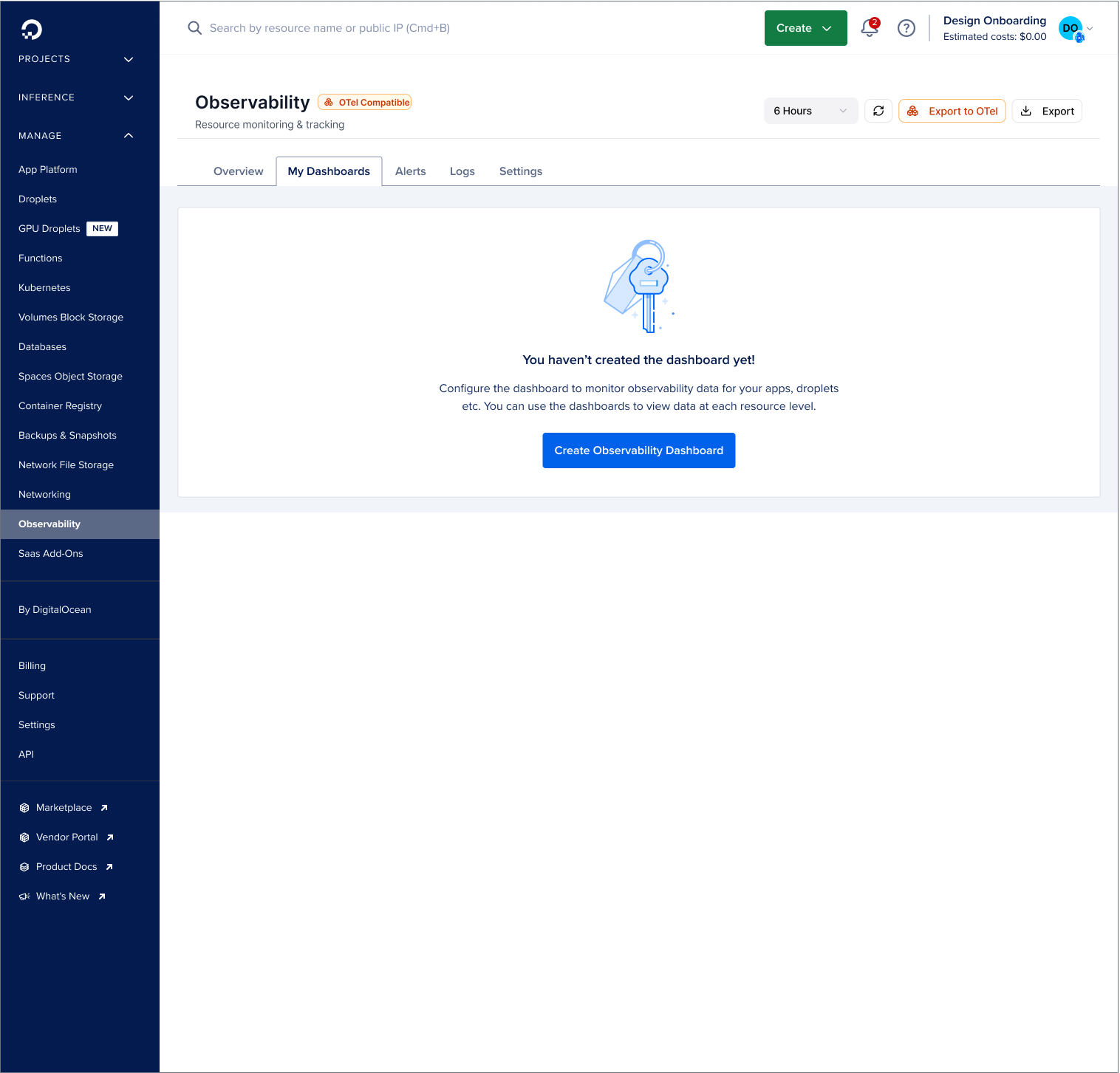
Observability Dashboard — fleet-wide health, triggered alerts, PCI health status & OTel-compatible
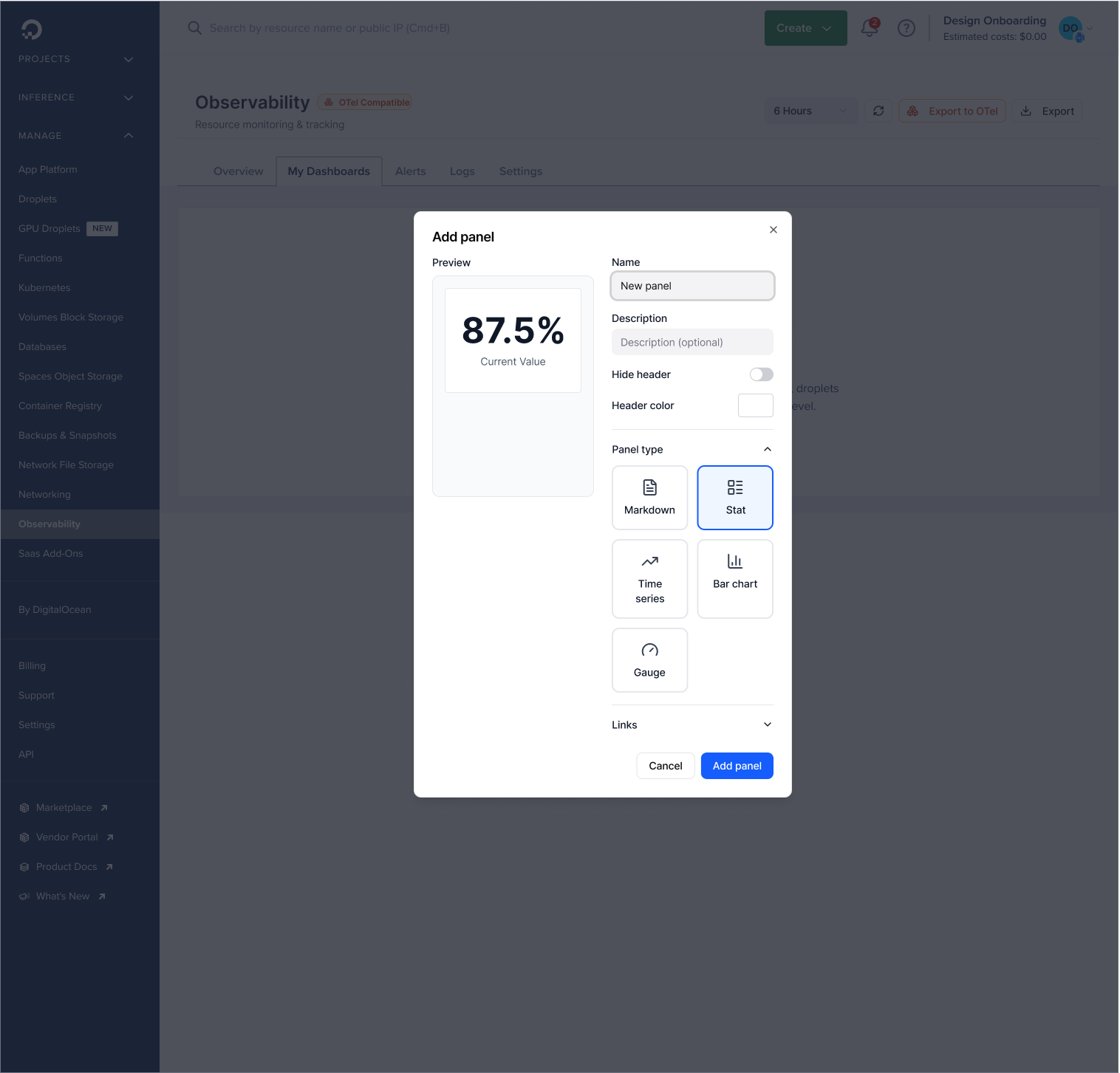
Create Dashboard — Users can create customized dashboards to track specific metrics
Create Dashboard — Add & customize metrics to dashboard
OUTCOME
A COHESIVE PLATFORM THAT HOLDS TOGETHER
The core deliverable was a cohesive observability experience across multiple product areas that had never shared a design language before. Users could now move from their Kubernetes cluster health to their inference cost dashboard to their GPU Droplet metrics without re-learning a new interface at each step.
The Advanced Metrics tiering created a clear upgrade path from free to paid GPU telemetry — making the business case visible inside the product itself.
PRODUCT OUTCOME
COHESIVE OBSERVABILITY EXPERIENCE
One coherent system from multiple independent roadmaps
DESIGN OUTCOME
ONE REUSABLE DESIGN SYSTEM
Shared components, patterns & hierarchy across all surfaces for consistency and faster development
0 → 1 launch
3 MONTHS TO SHIP
From first design session to Public Preview in the production codebase at DigitalOcean’s Annual Conference