
Tanzu Data Services
Turning fragmented developer tools into a unified services platform
I led the 0→1 design strategy and end-to-end experience for Tanzu Data Services — creating a new way for developers to discover and consume services while enabling platform teams to publish, manage and monitor them.
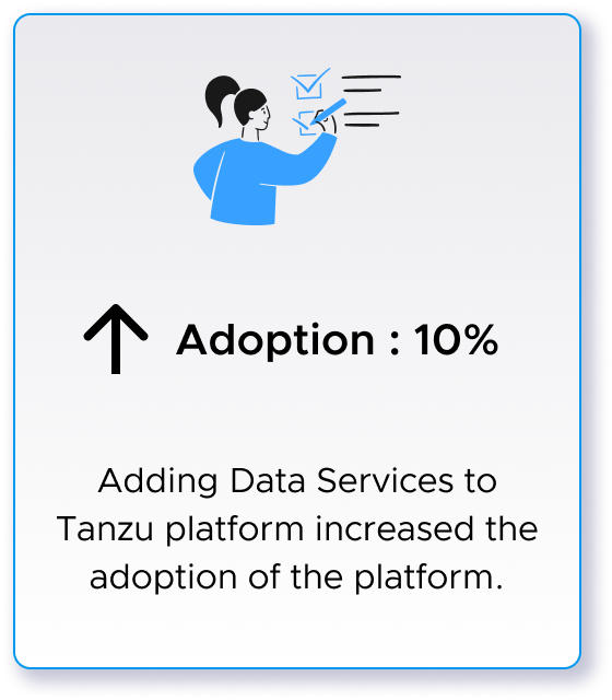
+10%
Platform Adoption
AT A GLANCE
SCOPE
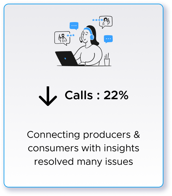
-22%
Support Calls
PARTNERS
Product · Engineering · Design · Business · Marketing · Technical Sales
0 → 1
GUI Based Experience Launch
ROLE
Staff Product Designer / Design Lead
Product strategy · Research · Experience architecture · End-to-end product design · Design system · Cross-functional alignment
IMPACT
THE CHALLENGE
THE PLATFORM HAD SERVICES, BUT NO SERVICE EXPRIENCE
Tanzu enabled developers to build & deploy applications, but the services those applications depended on were fragmented across different tools or missing.
Developers relied heavily on CLI-based workflows to discover and consume services. Service providers lacked a consistent way to publish and manage them. Platform teams had limited visibility into service usage and health.
Users needed to move through an entire service lifecycle as journey not separate tools: Discover → Provision → Connect → Monitor → Manage
Our opportunity was bigger than creating a GUI for existing functionality: How might we make services a first-class capability of the Tanzu platform?
MY ROLE AND PROCESS
DEFINING THE PRODUCT WHILE DESIGNING IT
This was a newly formed team building a net-new experience with no established product model or design precedent.
As the Staff Designer, I worked across strategy and execution — partnering with stakeholders to understand opportunity, define experience vision, establish the service model, prioritize the MVP and translate that strategy into an end-to-end product.
My responsibilities included:
Defining the product and experience strategy
Leading user research and synthesis
Establishing the information architecture and service lifecycle
Facilitating alignment across Product, Engineering, and business stakeholders
Designing the end-to-end experience
Establishing reusable patterns with the design system
Mentoring designers and strengthening design practices within the team
EVANGELIZING DESIGN PROCESS

RESEARCH REVEALED THIS WASN’T ONE WORKFLOW
I led foundational user research across internal and external teams:
Conducted interviews with developers and platform engineers to uncover core frustrations and unmet needs.
Identified key use cases for both producer and consumer workflows.
Synthesized findings into actionable personas, journey maps, and opportunity areas
The research surfaced a critical insight:
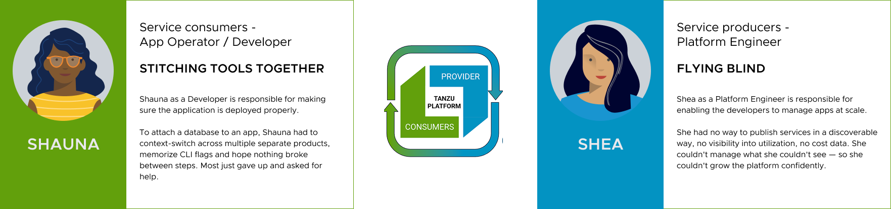
We weren't designing for one user. We were connecting two sides of an ecosystem, where needs were different but deeply interconnected.
A provider's ability to publish and configure a service determined what a developer could discover and consume.
This shifted our thinking from designing individual tools toward designing the end-to-end service lifecycle.
UNDERSTANDING ECOSYSTEM
BUSINESS GOALS
Collaborated with PM to define business goals
Increase adoption of Tanzu platform among developer community by providing data services
Reduce support calls by helping developers self-serve to identify services and attach to applications
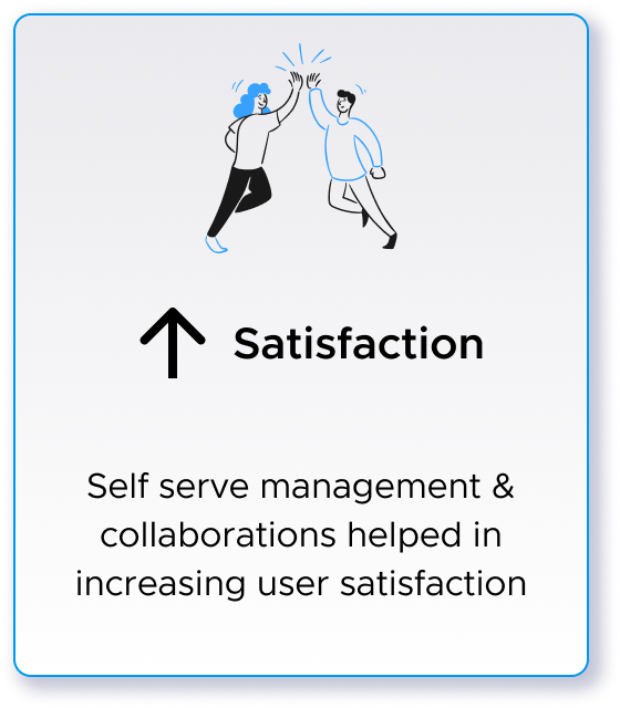
Improve trust and satisfaction among users
KPIs
DESIGN BRAINSTORM
BRINGING TEAM TOGETHER WITH EMPATHY
I conducted series of structured workshops — producers and consumers in separate sessions first, then together — using storyboards to make abstract workflows tangible. Storyboards were deliberate: they let engineering challenge feasibility early and let business stakeholders see user impact without needing to read a spec.
Participants
Design
Product
Engineering
Business/Marketing
Tech. Sales
STORYBOARDS


DEFINING THE STRATEGY
MAKE SERVICES FIRST-CLASS PLATFORM CAPABILITY
As cohesive experience, I proposed organizing the product around a shared service lifecycle :
Discover → Review → Provision → Connect → Monitor → Manage
This lifecycle became the experience architecture for the platform. It gave project team a shared model for thinking about the experience and helped us identify where capabilities should connect rather than exist as isolated features.
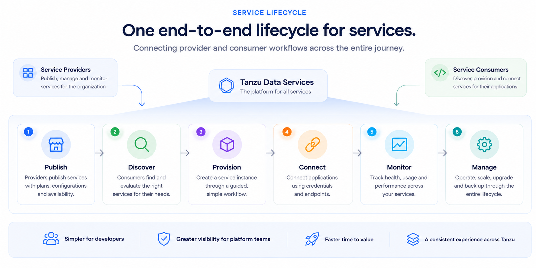
The strategy established three principles:
One lifecycle - Connect previously fragmented workflows into one coherent journey.
Abstract complexity - Let the platform handle infrastructure complexity so developers can focus on consuming services.
Design for extensibility - Create patterns that could support additional services and capabilities as Tanzu evolved.
FROM STRATEGY TO EXECUTION
A VISION BEYOND THE QUICK FIX
I explored various design patterns and designed north-star experience, but we couldn't build every capability at once. The initial leadership response was to scope it down: add a service list to an existing page, ship in six weeks, move on. I pushed back — not with opinion, but with the data we'd gathered.
PIVOT: What leadership wanted vs. what I proposed
Leadership's ask: A service list embedded in an existing screen. Fast, low-risk, shippable in weeks.
My case: A bolt-on list wouldn't solve discoverability — developers still wouldn't know what was available or how to use it. It wouldn't help admins publish or manage. And it would create another fragmented surface we'd have to undo later.
The outcome: I presented a side-by-side: the short-term patch vs. an investment in a proper marketplace and management layer — with projected support ticket reduction and adoption lift. Leadership approved the full scope. We had one quarter to ship something production-ready.
Winning that conversation meant co-owning the outcome. I partnered with the PM to define success metrics upfront, set MVP scope, and create a shared north star that kept engineering, marketing and tech sales aligned throughout.
DRIVING ALIGNMENT
TURNING DIFFERENT PERSPECTIVES INTO SHARED PRODUCT DIRECTION
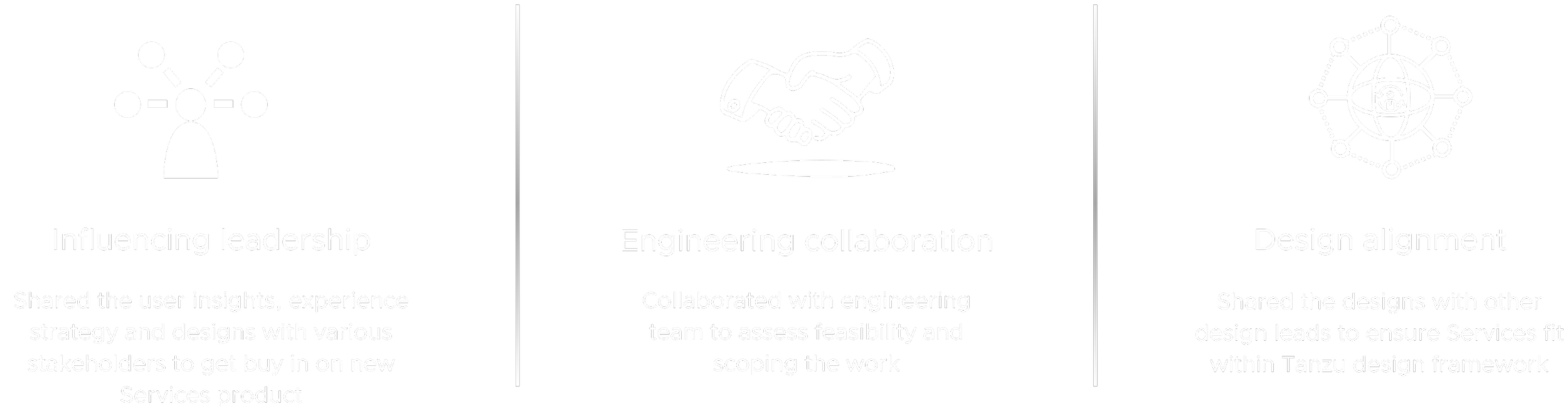
I used research insights, journey maps, workshops, prototypes & the service lifecycle to make abstract product discussions tangible. Rather than presenting finished designs for approval, I involved stakeholders throughout the process so product decisions and experience decisions evolved together.
This helped the team align around both the long-term vision and what we needed to deliver first.
FINAL DESIGNS
DISCOVER: FIND THE RIGHT SERVICE WITHOUT KNOWING WHERE IT LIVES
The Marketplace created a single place for developers to discover services available across the Tanzu ecosystem.
Rather than requiring users to understand which underlying product or provider owned a service, the experience centered on what developers needed for their application.
Create Service Instance : Guided step-by-step process to create local version of selected service with plenty of help
Marketplace : Easy to discover required resources with visually highlighting on Tanzu supported resources
Service Details : Service details with metadata, attached apps & visualizations of resource utilization & topology
Topology : Visualization of services & other reouces are connected on the platform
Strategy in the UI: Abstract organizational complexity behind a unified service catalog.
PROVISION: TURN INFRASTRUCTURE CONFIG INTO A GUIDED WORKFLOW
Once developers selected a service, they needed to configure and provision an instance.
I translated what had been a technically complex workflow into a step-by-step experience that surfaced the right information at the right moment.
Strategy in the UI: Progressively disclose complexity instead of exposing it all upfront.
MANAGE: GIVE DEVS ONE PLACE TO UNDERSTAND THEIR SERVICE
After provisioning, users needed to know whether the service was healthy, how it was configured, and what applications depended on it. The service detail experience brought these signals together around the resource rather than forcing users to navigate between tools.
Strategy in the UI: Organize information around the user's resource, not the platform's internal architecture.
UNDERSTAND RELATIONS: MAKE INVISIBLE INFRASTRUCTURE RELATIONS VISIBLE
As applications became more complex, understanding relationships between services and applications became increasingly important.
Topology provided a visual model of those dependencies, helping users understand how resources connected across the platform.
Strategy in the UI: Turn platform complexity into a model users can understand at a glance.
DESIGN TO SCALE
BUILDING SCALABLE DESIGN FOUNDATION
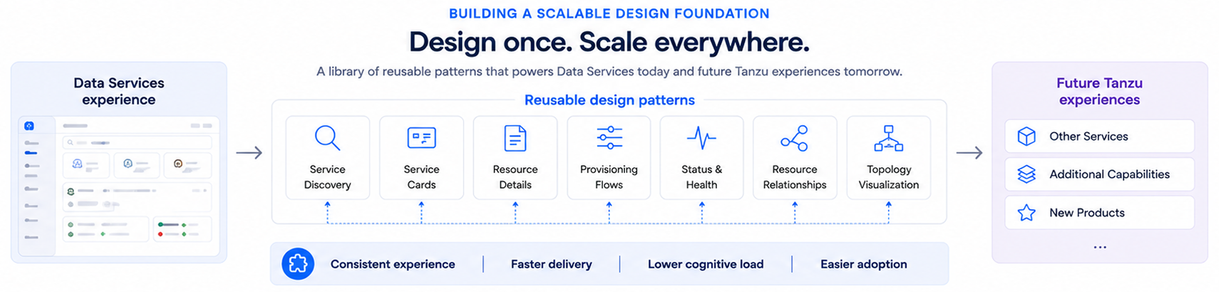
The product experience was only one part of my contribution. I collaborated with the broader design system team to identify what should become reusable across Tanzu.
Instead of creating one-off solutions for Data Services, we strengthened patterns around:
Resource hierarchy · Status · Service cards · Provisioning · Resource details · Relationships
I also worked with and mentored designers to help apply these patterns consistently as the platform evolved. The goal was not just consistency. It was to make the next product easier to design than the first.
IMPACT
FROM FRAGMENTED TOOLS TO COHESIVE PLATFORM CAPABILITY
We shipped to production users within three months and monitored for three months — the platform's first ever GUI-based data services experience. The service patterns we established became the foundation that subsequent Tanzu teams built on.
Beyond the numbers: the project established design's seat at the product strategy table on Tanzu. The research-led pushback on scope — and the delivery that followed — created a new model for how design and product collaborated on the platform going forward.